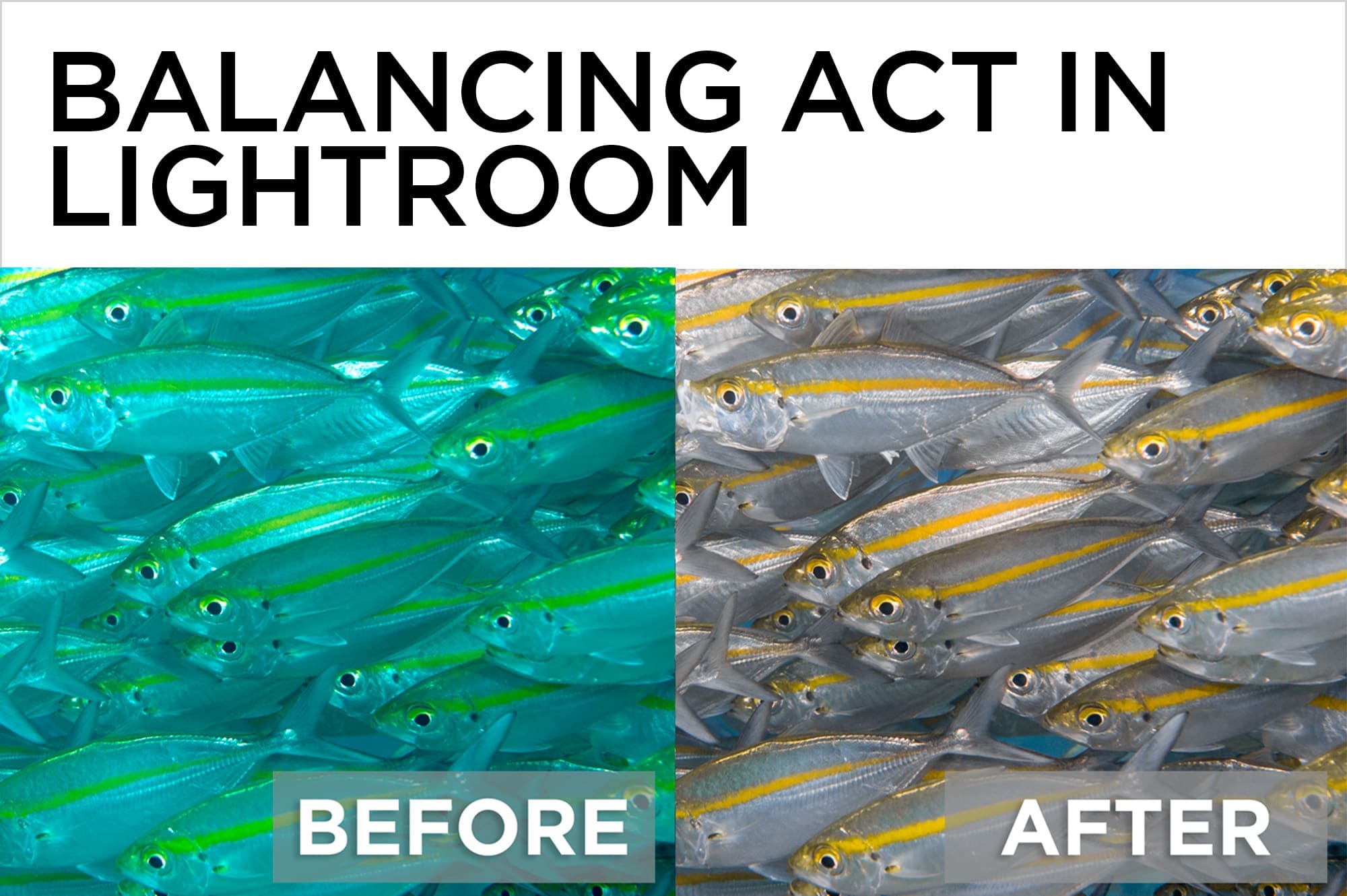
Balancing Act in Lightroom
The right white balance can make or break an underwater photo. Some shots need just a single click with the White Balance eyedropper in Lightroom or Adobe Camera Raw to restore color and knock out unwanted ambient light. Others, in which the white balance isn’t the same across the entire image, require more specific editing. The HSL panel works in concert with local tools like the Adjustment Brush or Graduated Filter to combine multiple white balances, or to add a touch of color correction just where it’s needed.
The White Balance Panel
The White Balance tools live in the top section of Lightroom’s Basic panel and consist of three main components – the Eyedropper, which samples from pixels in the image to set the white balance, the Temp slider (blue to yellow), and the Tint slider (green to magenta).
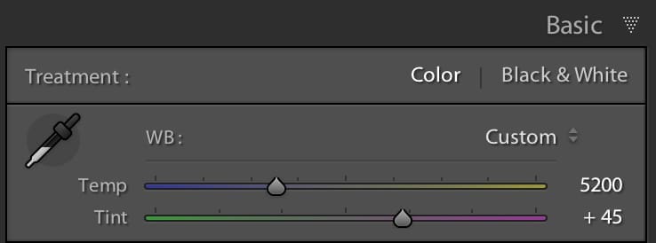
- In the Basic Panel of LR, pop the white balance eyedropper out of its dock by clicking on it (keyboard shortcut “W”), and move it over the image. The Navigator window at the top left panel in the Develop Module gives you a live preview of the white balance adjustment as you move the dropper around.
- Click on a spot that should be neutral in the scene. Don’t look for pure white – the trick is to click with the eyedropper in an area that should be neutral (gray), but isn’t. Some good spots to start with are sand, silvery fish, or tanks. If you don’t nail the white balance at first, click as many times as you need to get it in the ballpark. To reset the original white balance, choose “As Shot” from the WB presets drop-down menu.
- Use the Temp and/or Tint sliders to fine-tune your work. If the image looks too blue, ease the temperature slider towards yellow. If it looks too pink, nudge the tint slider towards green. Since the colors are opposites on the color wheel, they neutralize each other.
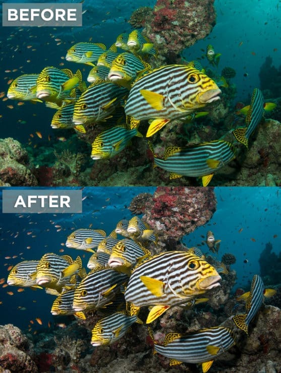
If the White Balance adjustment looks good on part of your image, but throws the rest of it out of whack, it’s time to use HSL or Lightroom’s local tools to finish the job.
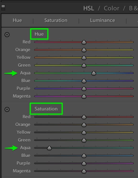
HSL – Hue, Saturation, and Luminance
The HSL Panel lets you adjust the characteristics of specific colors individually, but globally. Like colors across the entire image will be affected.
Hue is the actual color of something – think royal blue vs. turquoise blue. Both are blue, but they have different hues.
Saturation is the intensity of a color. Saturated colors are more vivid, and desaturated colors look gray.
Luminance is the lightness or darkness of a color.
- In the Hue tab of HSL, move the color sliders to shift the corresponding color’s hue. Moving the Aqua slider to the right minimizes cyan casts. Green to the left pops anything yellow. Purple and/or Magenta to the left offsets pinkish surface highlights.
- In the Saturation tab of HSL, move the sliders to the left to desaturate areas of corresponding colors in your image, or to the right to saturate them. Don’t desaturate so much that the area looks gray. Desaturating Aqua and/or Green neutralizes ambient light. If parts of your image are too warm, try desaturating Red or Orange. If you need to increase the saturation of a color, resist the urge to overdo it. Oversaturation is a common cause of edited photos looking “worked”.
- In the Luminance Panel, lightening a color (nudging the slider to the right) makes it appear less saturated.
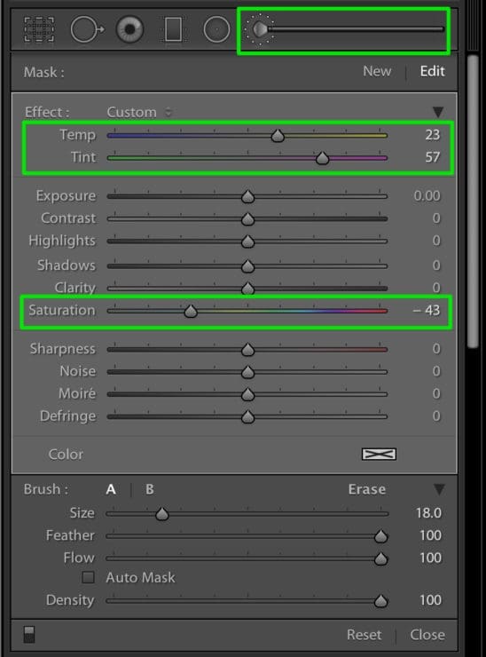
The Adjustment Brush and Graduated Filter
- Set all of the sliders to zero by double-clicking the word “Effect” at the top right of the panel.
- Decide what color you want to neutralize. If you want to knock back green, set the Tint slider towards magenta. To reduce blue, move the Temp slider towards yellow. Don’t worry about pinpointing an exact setting right away, but be sure to enter a big enough value so you can see where the image is affected. You won’t see anything happen until you add a brush or filter!
- Paint with a brush (“K”) or add a filter (“M”) to the area you want to edit. Tap keyboard shortcut “H” to hide and show an outline and the edit pin.
- Go back to the sliders and finesse the result. If you need more muscle, add the Saturation slider into the mix and desaturate slightly.
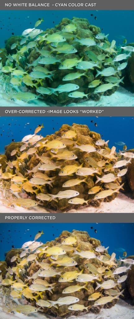
It’s critical to continually check Before and After views so that you don’t go too far. Nothing ruins an image faster than bad editing.
Tapping backslash “\” in the Develop Module toggles a full Before and After, and the keyboard shortcut “Y” toggles a side-by-side view.
You can find video tutorials describing these techniques at http://bit.ly/LRWhiteBalance http://bit.ly/GoAskErin_CyanOfDeath1 and http://bit.ly/goaskerin_filters