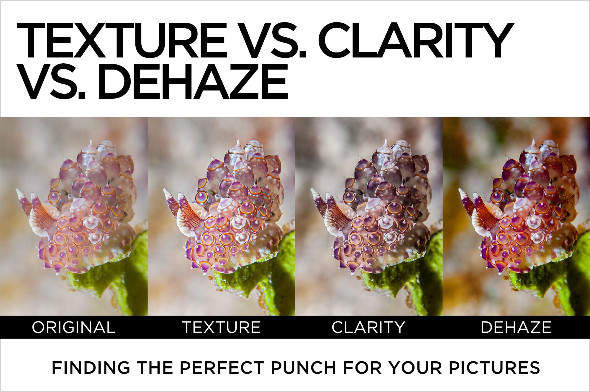
Texture vs. Clarity vs. Dehaze
Finding the Perfect Punch for Your Pictures
I simultaneously love and fear the addition of any significant new feature in Lightroom or Photoshop. Love, because it potentially enriches my editing bag of tricks. Fear, because for a time after its initial introduction it’s used to excess by pros and enthusiastic amateurs alike, resulting in a spate of over- processed pictures.
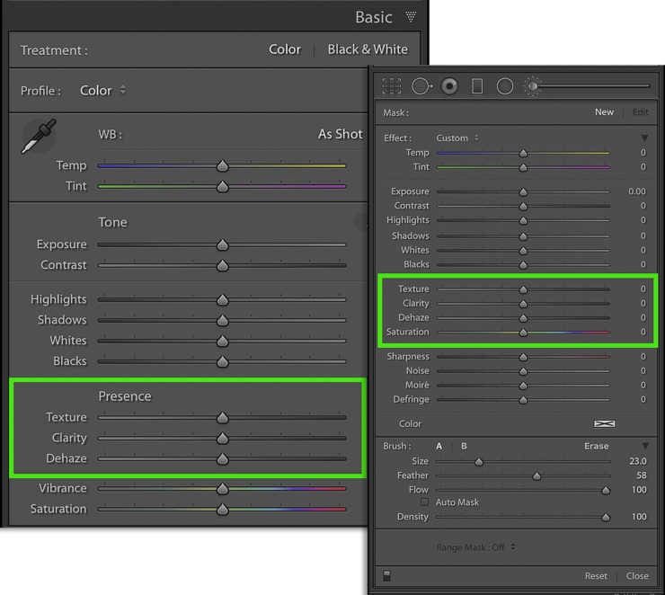
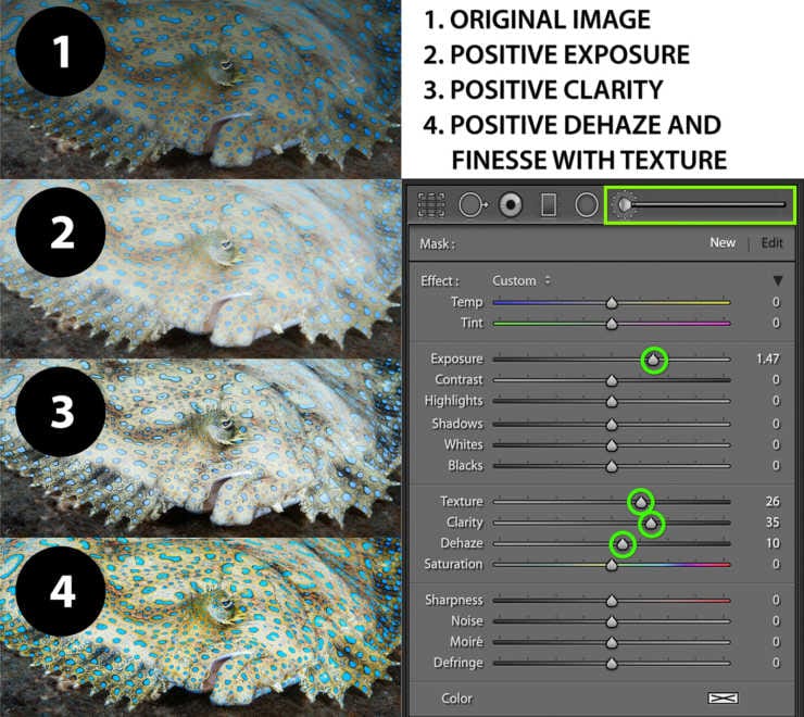
Luckily, the recently introduced Texture slider is more nuanced than nuclear, and has some interesting applications for underwater photos. The slider is nested with Clarity and Dehaze in the Presence section of the Basic panel, and can also be used locally with the Adjustment Brush, and Graduated or Radial Filters.
Texture, Clarity, and Dehaze share the common goal of enhancing or diminishing detail, but they each do it on a different scale. All three controls are variants of sharpening, but each targets a different range of frequency in an image, resulting in perceived sharpness and contrast changes that can also involve luminance (tone) and saturation (color).
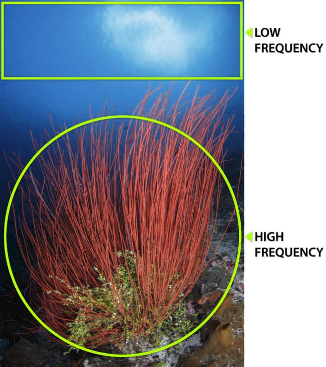
What is Frequency?
In an effort to avoid getting too wonky, it’s best to simplify the concept of frequency by describing it in terms of edges. Details of an image that change rapidly from light to dark, like the sharp edges that define individual hairs are considered high frequency. Low frequency areas exist where the change from light to dark along edges is gradual, as it is on a gradient or bokeh (blurred) background.
Texture
Texture is a unique control that shares similarities with Clarity, Sharpening, and Noise Reduction. It’s built to work primarily on mid to high frequency areas of contrast, and because it typically affects narrow edges that span a small range of pixels, Texture is subtler than Clarity or Dehaze. It can still be a strong enhancement, but across smaller edges. Unlike both Clarity and Dehaze, Texture doesn’t significantly shift color or saturation.
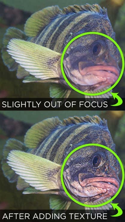
Texture is great for creating the appearance of local sharpness on slightly out of focus areas, and adds a nice boost to coral texture, scales, and water surface detail. Use it at on multiple brushes or filters for maximum effect.
When set to a negative value, Texture functions as a smoothing tool that can help eliminate small particles of powdery backscatter at the edges of images where strobes were too bright or too far forward.
Clarity
I’ve heard Clarity aptly described as one part sharpening, one part tone mapping, and one part magic. It’s capable of much stronger effects than Texture, but it doesn’t have the same impact on fine detail like Texture or across wider swaths of low frequency tone and color like Dehaze.
Clarity helps to define light and shadow areas and general textures within an image, increasing or diminishing the appearance of sharpness and overall “punch”. Large positive values of Clarity tend to desaturate color and significantly shift luminance and can leave the photo with a gritty, “worked” feel.
Clarity does an excellent job of enhancing light rays, and applied on a brush or filter is a fantastic way to pop detail in critters with translucent bodies or fins. It performs near magic on black-water images. Clarity works well in combination with Texture and Dehaze. A multi-slider “recipe” I use frequently is:
- Brush an elevated Exposure value across an area that needs emphasis.
- On the same brush, add a pinch of positive Clarity.
- Again on the same brush, add a drop of positive Dehaze.
- Adjust Texture to taste.
Elevated Exposure tends to make the brushed area appear washed out and flat, but adding Clarity enhances mid-tone contrast, and increased Dehaze replaces lost color. Voila!
Dehaze
Dehaze is intended to add or remove atmospheric haze from an image. Contrast and color are reduced when a photo is shot with too much water between subject and lens, or in less than perfect visibility. Dehaze increases contrast in low frequency areas (broader areas of color or tone), and saturates color casts – even in very bright or dark areas. It does a great job of amplifying color and contrast where an image might appear “washed out”.
Underwater photographers typically aim to neutralize the same color casts that Dehaze intensifies, so it’s not always a perfect global tool for color images. It excels with local tools to sharpen up silhouettes of reef edges, divers, or faraway objects. It’s also an effective control for black and white images. Black and white photos benefit from a more intense level of contrast, and color shifts aren’t an issue.
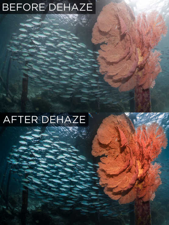
Be gentle when using Dehaze – a heavy hand on the slider delivers a gummy mess of color and contrast, resulting in an artificial, amateurish looking edit.
You can vastly improve your photos by understanding how Texture, Clarity, and Dehaze each work, the kind of images each works best with, and how they interact. But don’t take it from me – true magic only happens when you develop a sense of how these controls work with your own pictures. Dive in and explore – there’s no better teacher than hands-on experience.
Pro Tip:
Always check a zoomed in 1:1 view as well as a zoomed out 1:2 view to accurately assess the effects of Texture, Clarity, or Dehaze.