Wreck Tech in Post – 3 tips for editing wreck photos
I love working with wreck photos. They’re rich with all kinds of form, texture and gritty, scratchy detail. They’re dramatic and moody, and hold up surprisingly well in less-than-perfect conditions. Here are 3 tips to help make wreck images pop in post.
- Do Black and White right.
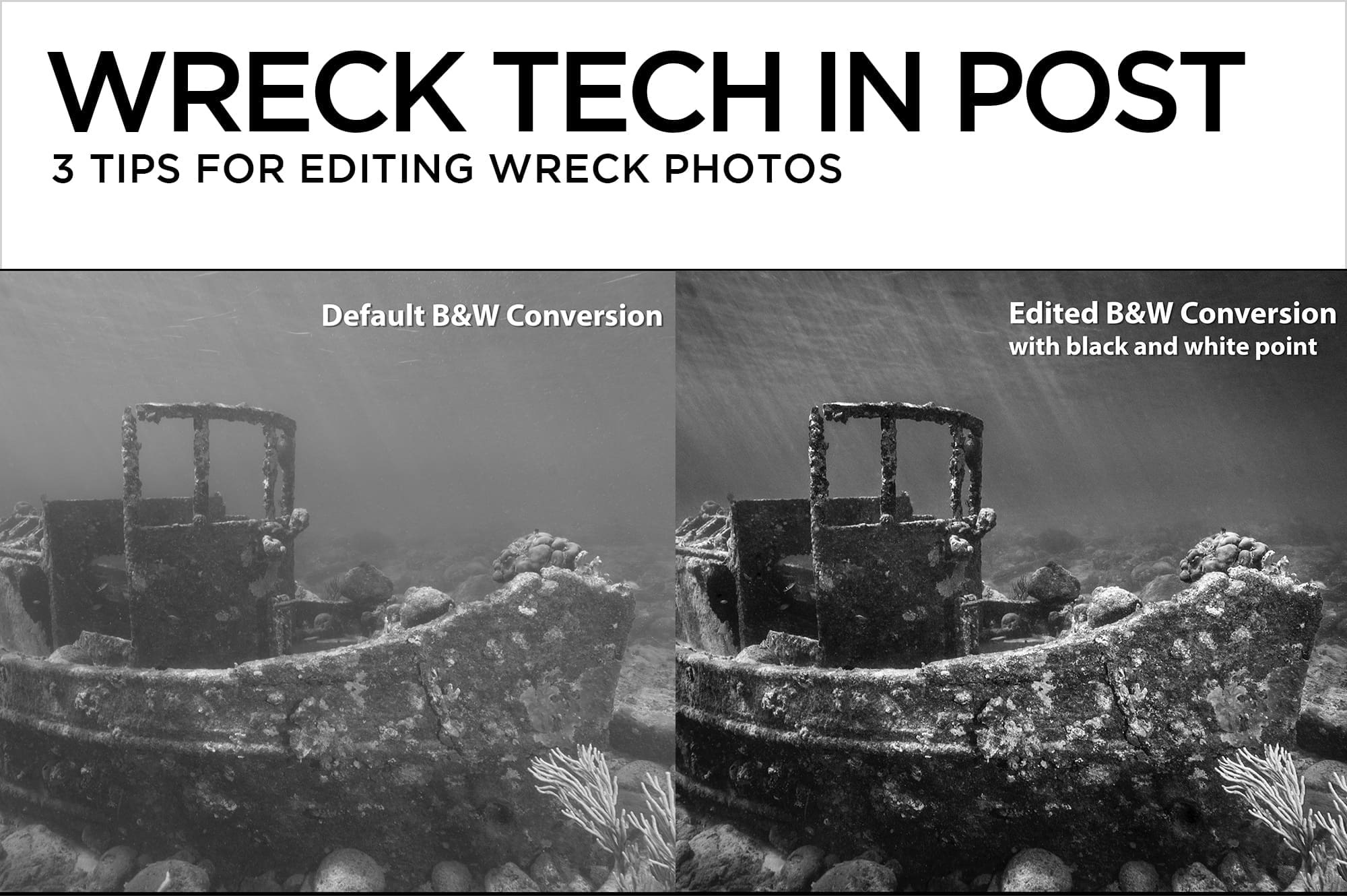
Wreck photos shot with ambient light are excellent subjects for black and white images. Unfortunately, the default grayscale conversions in Lightroom and Photoshop produce lackluster results. A dramatic black and white photo must have clean black and pure white somewhere in the picture. Add punch to your shot by setting real black and white points using the clipping previews in Lightroom or ACR (Adobe Camera Raw).
![]()
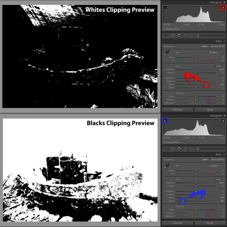
In the Basic Panel, hold down Opt (Mac)/Alt (PC) while moving the Whites slider to the right. At first, the clipping preview will be completely black, but as the slider moves right, areas of white will appear. As soon as you see some white, back off until there’s just a tiny speck. Release Opt/Alt. You’ve just set the white point.
Go to the Blacks slider and hold down Opt or Alt as you move it to the left. The clipping preview will be completely white this time. As the slider moves left, small areas of black will appear. When you start to see black, back off until there are just a few black pixels showing. That’s your black point.
Continue to build drama in the image using the rest of the tools at your command, and when you reach a stopping place, re-adjust the black and white points as a final step in the conversion process.
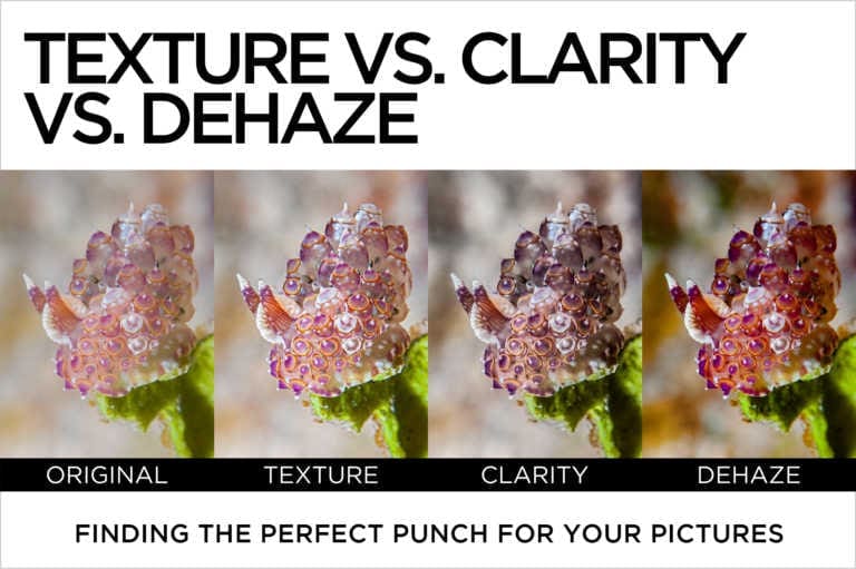
- Add contrast and texture using Clarity and Dehaze.
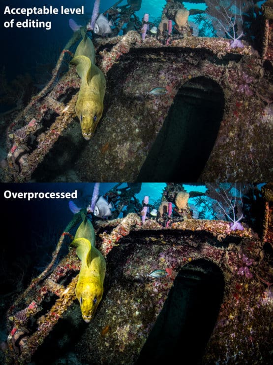
Clarity is a slider that when applied in a positive amount, makes images appear crisper and more dimensional. Applied in a negative amount, it creates a soft focus effect. Unlike the Contrast slider, which makes brights brighter and darks darker across the entire dynamic range of the picture, Clarity targets only the midtones, increasing contrast in the big juicy middle of the image while protecting the brightest and darkest parts of the photo from clipping (losing data).
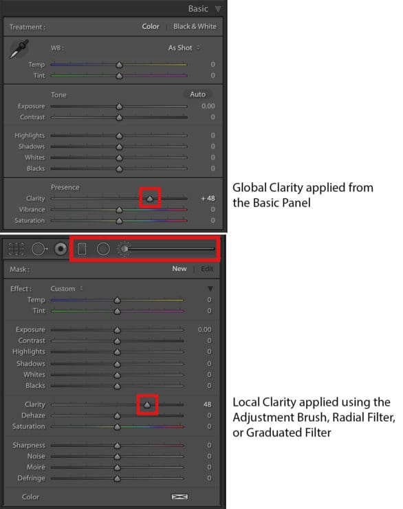
Clarity is one of the most impressive and satisfying sliders in Lightroom, but it’s frequently over-used. A heavy hand on the Clarity slider can result in a noticeably “crunchy” picture, so use a light touch when applying it globally from the Basic panel. Clarity applied selectively to the image by using multiple brushes and/or filters is often more effective than a single big global pass.
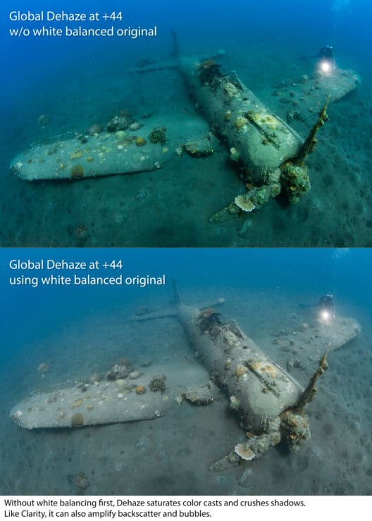
The Dehaze slider in the Effects panel of Lightroom CC and ACR is meant to either add or remove atmospheric haze. Before using Dehaze globally on a color image, it’s neccessary to set the white balance, since Dehaze tends to exaggerate undesirable color casts in underwater images.
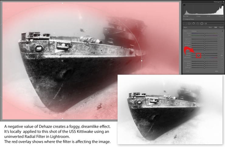
As with Clarity, another way to use Dehaze is selectively. It can be applied locally with an Adjustment Brush, Graduated Filter, or Radial Filter to add emphasis and intensity just where it’s needed. Try using both Clarity and Dehaze on the same brush or filter to super-texturize a black and white wreck shot. Applied in a negative amount, Dehaze creates an eerie fading-into-the-gloom effect. Dehaze is not available in non-Creative Cloud versions of Lightroom or Photoshop.
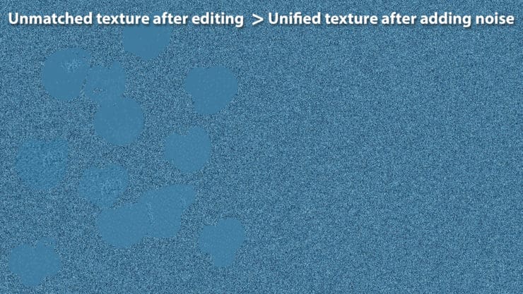
- Add Grain to unify the image after editing.
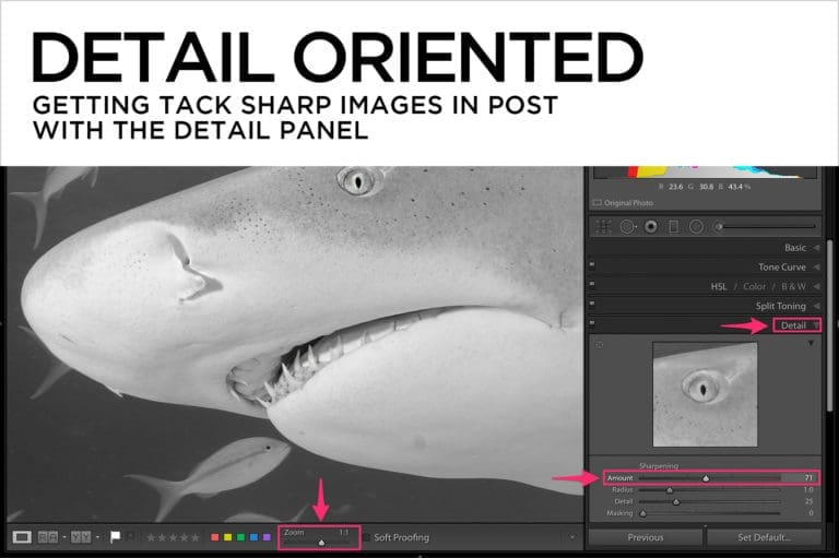
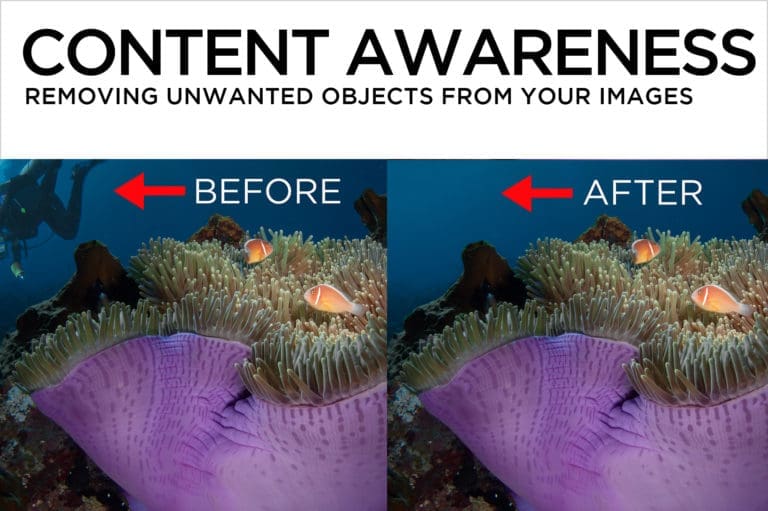
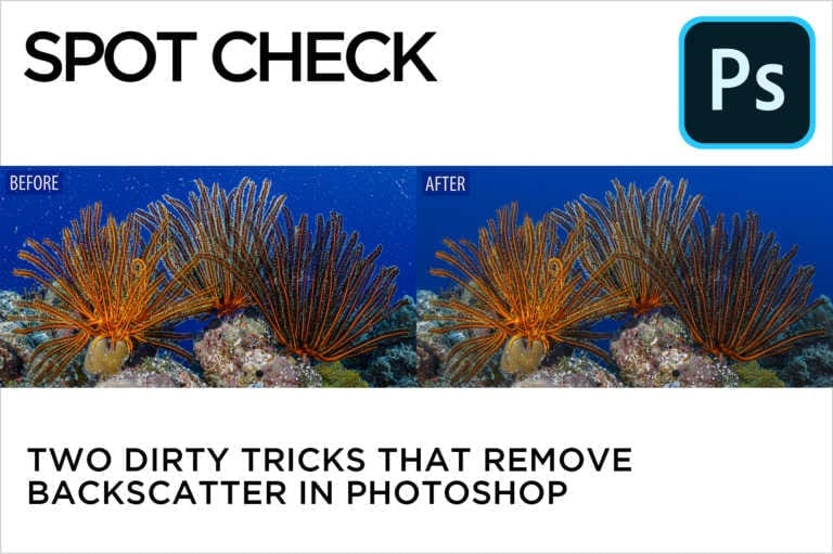
It’s anathema to most photographers to think of adding noise to their images, but after lots of bubble and backscatter removal, adding grain helps to unify texture across the entire photo. When not used carefully, the Spot Removal Tool in Lightroom and ACR leaves behind telltale edge artifacts. Likewise, the Healing, Cloning, and Content Aware Fill tools in Photoshop are frequently guilty of blurring, smudging, or granulating pixels. Adding a small amount of grain camouflages clunky edits and increases apparent sharpness for printing.
In the Develop Module Effects Panel of Lightroom and Adobe Camera Raw, there are three Grain sliders.
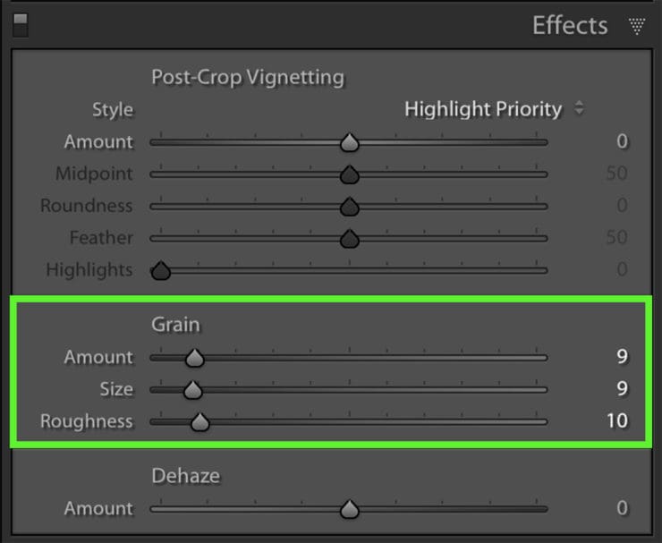
When the Amount slider is set to zero, the other two sliders are inactive, so decide how much grain to add to the image by first moving the Amount slider to the right. Zoom into an edited area and add just enough grain so that the edits aren’t disrupting the texture of the photo. The Size slider controls how big or small the individual grains are while the Roughness slider varies virtual texture of the grain. You can toggle the Grain effect on and off by clicking the small “switch” in the upper left corner of the Effects panel.
I find that Grain settings Amount 9, Size 9, and Roughness 10 often work for me. Don’t ask me why, they just do.